Sunday, June 7, 2015

Process DETAILS.....


I wanted to begin by going into a bit more detail on how I start my portraits. Over the years I have tried many different techniques, but this one works best for me. I have worked this technique to the past 10 years, at least. I work with a projector instead of taking the extra time to do a free-hand drawing. The color portion of the portrait is the most important part, in my opinion. If the drawing isn't correct in the beginning, then the final piece will be absolutely worthless. The pencil drawing is SUPER important, because it helps me to understand the structure of the face that I am drawing. But as you will see later in this post the pencil lines are erased and I freehand the colored pencil application while only using the original image for my color choices and where the shadows/highlights show up on the face. 

I always start by making sure that my paper is cut to the exact size that I will be working on. For this specific piece I will be working on an 18"x24" sheet of paper. The only paper that I had here was 19"x24", so before getting started I measured out an inch on the 19" side of the paper with my T-ruler and cut off the excess.


Cutting off the excess inch

Erasing all any extra marks 
My main supplies are:
  • Strathmore Drawing Paper
  • Electric Sharpener - better than killing my fingers with a manual one
  • Ruler
  • Pencil brush - Eliminates stray pencil shavings before they can make a mess of my work
  • Scissors
  • Pencil
  • Eraser
  • Prismacolor Colored Pencils (There are no others in my opinion :)
  • Sharpie Marker - mostly for the pupil in the eye
  • White Gel Pen - for highlights in the eyes and on the lips
  • My Color Journal - for keeping up with my color choices for specific portraits


My set up

This portrait is a split image of mom and daughter. The top half of the portrait will contain the older image and the bottom half will contain a more current image. In order to get the placement of the image right I had to make sure to measure and pencil in a midline to create a small space in between the images. No need for the images to run together.

Original images

Midline added

I, personally, use a Prism Opaque Projector to enlarge my images. This ensures that I get the image traced onto my final paper without issues or extra time spent on the drawing portion. At close to $300 this projector can enlarge images up to 20x the original size and the picture is clear enough for me to transfer small details for the final image. I also have a handy-dandy stand for it. After years of using a stool I figured it was worth the purchase. It is super easy to use, too. You just take you original image, which I printed as a 5"x7" image on photo paper. Flip the photo upside-down and place the photo underneath the metal clip located under the lid. Close the lid and turn it on, then I can work with the machine to get the final image the size I want. I place my paper onto the wall using sticky tack on the four corners on my paper.

My Prism Opaque Projector

Orignial 5"x7" on photo paper
Ready to be placed upside-down and projected onto the wall

The image projected onto my paper

From this point,  I will take a pencil and eraser and sit my happy butt on the floor.  I have a small home and space is limited, so I use a small corner of my art room. I will trace off as many specific details as I can. This usually takes about 25-30 minutes depending on the size of the image. Once the first image is complete, then I used the same steps for the 2nd image. Once both images have been transferred, then I take a ruler and add at least a 1/2" border around the edge of the entire page. I erase any of the drawing the goes over the 1/2" mark. The final image is not perfect by any means, so I usually go back into the drawing and fix any problems that I see. I try to keep my pencils lines as light as possible, because these will all have to be erased as I go. Stray pencil lines are not going to help to make the piece look like a professional portrait.

Pencil drawing COMPLETE

Measuring 1/2" border
After I complete this drawing process I always choose my colors for the eyes, mouth, skin tone, and hair. This is so I don't have to stop in between sections and make these choices. When you are in the zone it just makes things more difficult if you have to stop and work through color issues. About 7 years ago I began experimenting with recording my color choices with little swatches of the colored pencils. I choose colors that I believe will work for that specific image and if certain colors don't fit in the scheme when I am done, then I just mark them off of my swatch list. I now have a system where I number each choice, so that I know which color to add next. This has made it so much easier to take a break from a portrait and come back knowing just where I left off. It is embarrassing how many portraits I have given up on due to not knowing the colors that I was using or the place where I left off.


Example of my Color Journal


Eyes and Mouth are DONE
8 Skin Tone color choices are shown
I also wanted to show how I lighten all of the pencil lines as I go. It is a very tedious way to go about this, but it works for me so I have stuck with it. All of my pencil lines are as accurate as I can get them. When it come to the skin tone I erase sections as I go in order to add the color.

Original pencil lines
You can see the Cream outline on the chin and neck
Focus on the ear...


Erasing the pencil lines until barely visible

Outline ear with Cream Colored Pencil


One layer of flat color using the Cream Colored Pencil
Facial details are only lightly visible


As I work through layering my colors for the skin I have to keep in mind where my shadows lie. Once I start adding the slightly darker skin colors I begin adding a bit of the shadow, so I can keep up with where I need to keep building the skin tone. I don't use much pressure when working, but the slightest pressure helps to build up certain sections.


As far as I could get before needing to add the hair in


The cuteness is almost too much to handle<3 

More to come....


Monday, May 25, 2015

The Beautiful Jada Lebene...


When I began teaching again in 2011 I met a sweet, caring Elementary PE Teacher. She and her husband were raising money to adopt from Ghana. The process for this adoption is insane, but these two were ready for the task. I have been so impressed by their positivity and the love that they were ready to give to a child that they hadn’t even met yet. You can read more about their story on their official site https://www.purecharity.com/sarah-richardsons-adoption. They have since met their sweet daughter and they asked me to draw a 16"x20" portrait of the beauty that they will be bringing home very soon. 

Original Image


Started adding skin tone


Decided to finish out her shoulders


Darkening the shadows

Pink cheeks


Darkening her hair and skin tone

Hair detail

Finishing touches to face


Finished gold necklace and began yellow shirt


Shirt is complete and right half of background is cream


Finished piece


Sunday, May 24, 2015

ART Journal Fun...

I spent an AMAZING day with my talented friend Ashley (FeathersUNLEASHED). We both worked through a Art Journal Class that fellow blogger and artist,  Alisa Burke, had on sale. Her work is wonderful and her courses are FULL of fun, informative techniques for artists of all ages. We used the supplies that I already had available in my Art Room, but I think we did pretty well.

Ashley had never experienced mixed-media painting in the Kelly Rae Robert's style that I have become accustomed to, so we made our covers first using that method. We used acrylic paint to get our surface covered. We went through different techniques such as adding texture with scrapbook paper, stamping, brayer, dripping paint, bubble wrap, etc. Here's mine...
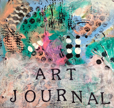
My front cover


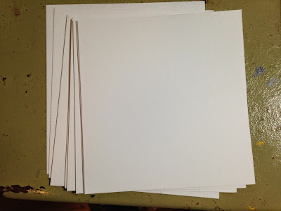
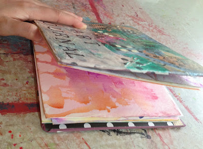
I chose an old childrens book with a square cover, so I cut my watercolor paper to fit nicely inside. Since blank paper can be the scariest part we used different supplies to decorate our pages. This is where the class came in, because this is a new way of creating a surface for me. I used watercolor to fill my 13 front and back pages.
Blank paper is the most frightening aspect

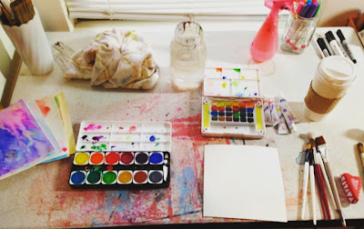
My set-up for the day

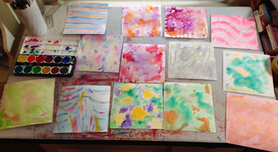
One side of my papers

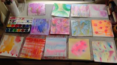
2nd side of my papers

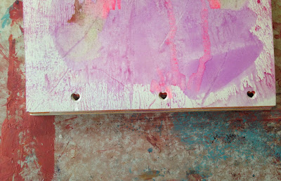
I only had a heart-shaped hole puncher
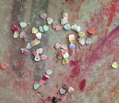
Cute, tiny hearts

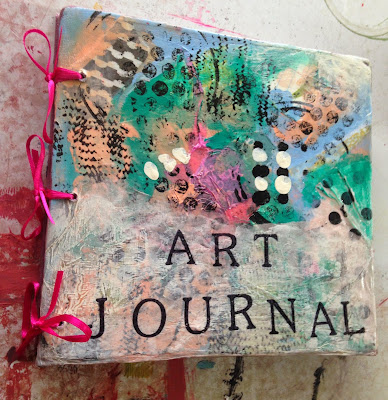
Bound with bright pink ribbon

All Done!

I didn't start the lessons immediately, but I did watch some and got started on my "Mark Making" page. I took out all of the pens and markers that I love using to add details to my drawings and paintings and went to town. I used gel pens, sharpie markers, and micron pens for the most part. It felt really good to just draw and add color/detail without worrying about the outcome. Sort of an experimentation of how different supplies work on the watercolor surface.

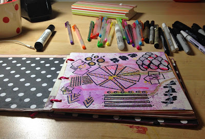
Lesson 1- Mark Making Page


Days later I was able to watch more of the lessons and jump into some more work. My son told me that I could work at his table in the living room, since he wanted me to watch Despicable Me 2 with him. So, I cleared a spot for myself and decided to go with a song lyric that has been weighing on my mind a lot lately, "Living on such sweet nothing". I painted the letters on with bluish-black watercolor and then painted the word "love" on the 3rd page of my ART Journal. This time I let the letters drip more and pool at the bottom of the page a bit.
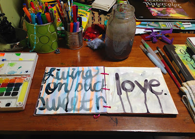
Lesson 2 - Bold lettering


 After allowing these to dry I began adding small details with a sharpie marker and added in small red hearts around the page. I splattered more watercolor onto the page and let that dry before adding my final words.
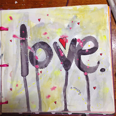
Sharpie detail & paint splatters 


 My final design was created after watching the 3rd lesson and debating whether or not I actually wanted to add photos to my journal. This photo popped into my head, because I knew that I already had a print of it lying around and it is one of my absolute favorites of my son. Not to mention the fact that it goes along with my bold lettering in the background. I added the photo using different colors of washi tape around the edges. Then, I finished it off by adding a thin sharpie outline around the figure, sharpie dots around the photo, and the words along the top.
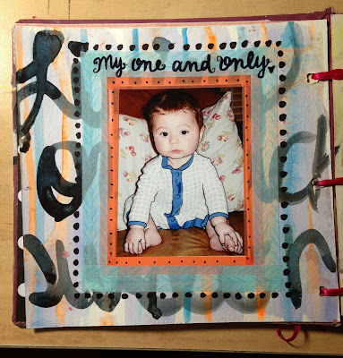
Lesson 3 - Layers with washi tape and photos


I have since finished all the videos in the class, but have not had the time or energy to add to my ART Journal. I am really hoping that tomorrow I will be able to open it up and be inspired! Ashley's Art Journal Post looks more into some of the different techniques and supplies that we used and you should definitely check it out!

Sunday, May 10, 2015

Mothers Day SURPRISE...

A few weeks back my friend, Keenan, came to me about an idea that she had for a portrait. She wanted me to create a colored pencil portrait of her grandmother, who is no longer with her sweet family. She sent me a photo of a photo and I wasn't sure that I could make it happen, but the image was BEAUTIFUL! It was gonna be tough, but I wanted more than anything to make this happen for her and her mom. We discussed a few of the details before-hand like the fact that her grandmother loved roses and when adding her name I HAD to add "Mrs", because that was important to her :) Just precious! Well, here is the process...ENJOY!

Original Image

Pencil Drawing


Figuring out the shadows


Progress with Original Image


Progress before adding the rose


Rose in the hair and first layer on the hair


Adding color to the rose


Rose is finished, background is started, and name is added


Finished piece with Original Image

Framed and pretty with a happy Mom